
Many e-commerce businesses focus on getting more traffic – running paid ads, doing SEO, posting on social media etc. But traffic alone doesn’t guarantee sales. Generating traffic is only half of the battles. You need to make your visitors take action – whether that’s making a purchase, signing up for a newsletter, or creating an account.
That’s where conversion rate optimization (CRO) comes in. By improving the percentage of visitors who become customers, you get more value from every marketing dollar you spend.
In this guide, I’ll break down what CRO is, why it matters for e-commerce, and how you can apply it to boost sales without increasing your ad budget.
 Book a CRO analysis here
What is a conversion rate?
A conversion rate is the percentage of visitors who complete a desired action such as purchasing a product, filling out a form, or subscribing to a service. Hence, for e-commerce, the most conversion rate is the numbers of checkout relative to the numbers of visitors. In this article, we’ll focus on e-commerce conversion rates and practical ways to improve them.
What is a good conversion rate?
There’s no single benchmark for a “good” conversion rate – it depends on your industry, target audience, and traffic sources.
That said, a 2023 survey by Ruler Analytics found that the average website conversion rate across fourteen industries was 2.9%. Some e-commerce stores see rates well above that, while others may convert at 1–2% and still be profitable, depending on their average order value and customer lifetime value.
What matters most is knowing your own baseline and aiming for steady improvement. Even a small lift from 2% to 2.5% can mean thousands in extra revenue without increasing traffic.
Why CRO Matters for E-commerce Businesses
Most online stores put the bulk of their marketing budget into getting more traffic. But if your website doesn’t convert well, every new visitor costs you more than it should. CRO is about making the most of the traffic you already have.
Think of it like this: if you have 10,000 monthly visitors and a 2% conversion rate, you’re getting 200 orders. Raise that to 3%, and you now have 300 orders – a 50% increase in sales without spending more on marketing.
So, by increasing your conversion rate, you:
– Get more revenue without increasing ad spend
– Improve ROI across paid ads, SEO, and email campaigns
– Lower your cost per acquisition (CPA)
– Create a better customer experience, which can also improve retention and referrals
What CRO Is (and Isn’t)
The process typically involves four key steps:
- Analyzing user behavior – Use tools like heatmaps, session recordings, and analytics to see where visitors click, scroll, and drop off.
- Identifying friction points – Spot the places where people get stuck, confused, or distracted, and figure out what’s causing the drop-off.
- Hypothesis and testing – Create targeted changes based on your findings, then run A/B or multivariate tests to see which version performs better.
- Repeat the first three steps. CRO is never “done.” Customer behavior and expectations shift over time, so ongoing testing and refinement are essential.
Five Core CRO Focus Areas for E-commerce
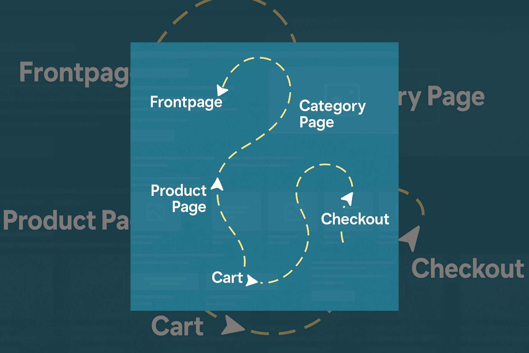
To maximize revenue, you need to optimize the entire visitor journey – from the moment they land on your homepage all the way to the final checkout click.
1. Homepage – The First Impression
Your homepage is your first impression, and it needs to instantly tell visitors who you are, what you sell, and why they should buy from you. The value proposition should sit above the fold so it’s seen without scrolling, supported by strong visuals and clear calls to action that guide people toward their next step. Product categories should be easy to access right from the start so shoppers can begin browsing without unnecessary clicks.
Instead of greeting visitors with a generic line like “Welcome to Our Store,” use a benefit-driven headline such as “Handcrafted Leather Bags – Free Shipping & Lifetime Guarantee” to communicate value immediately. Testing different combinations of headlines and imagery through A/B experiments often reveals which messages resonate most and drive engagement.
Pro tip: It’s worth remembering that most users only see the top 30% of your homepage, so that space should work hard. Avoid dedicating an entire section to showcasing just four products far down the page as the chances of matching exactly what a visitor wants are slim. Instead, feature key product categories or campaign items together in one section near the top, making it fast and easy for shoppers to jump to what’s most relevant to them. This simple change can dramatically improve the odds of turning a casual browser into a paying customer.
2. Category Pages – Helping Users Find Products Fast
Category pages should focus on clarity and easy navigation, because visitors often decide within just eight seconds whether to stay or leave. High-quality product images are essential, and filters for price, size, color, and other key attributes should work seamlessly to help shoppers find what they’re looking for quickly. Keep calls to action above the fold so they’re visible without scrolling.
A quick win is to add an on-hover “Add to Cart” button directly on product images. This lets shoppers place items into their basket without having to visit the product page, shortening the buying journey and removing unnecessary friction. Eye-tracking studies show that long category descriptions are often ignored, so keep text concise and make the product layout easy to scan.
Pro tip: Include breadcrumbs and clear subcategory navigation so visitors can move between sections without having to return to the homepage. This keeps them in shopping mode and reduces the risk of losing them mid-journey.between sections without restarting from the homepage, reducing frustration.
3. Product Pages – Where Buying Decisions Happen
Product pages are the make-or-break point in the buying journey. This is the place where a shopper decides whether to commit or click away. Multiple high-quality images are essential, including both clean product shots and lifestyle images that show the item in use. Key benefits should be highlighted clearly, ideally in short, easy-to-read points, and the add-to-cart button must remain prominent and usable on any device.
A simple but powerful improvement is adding a short trust statement near the buy button, such as “Free returns within 30 days,” and pairing it with visible star ratings or customer reviews directly on the product. This reassures hesitant buyers and builds confidence. Reviews and ratings should be placed above the fold so shoppers see them instantly without scrolling.
Pro tip: include breadcrumbs so customers can return to category pages in a single click rather than navigating back through the homepage. This keeps them in buying mode and reduces the risk of losing them during navigation.
4. Cart – Keep the Momentum
Once an item is in the cart, the goal is to make checkout feel inevitable. Any friction or delay at this stage can cause drop-offs and with abandoned carts averaging 69.9% of all e-commerce sessions globally, the stakes are high. The cart page should allow shoppers to easily adjust quantities or remove items, while always showing the total price clearly with no hidden fees. The checkout button needs to be prominent and impossible to miss.
To keep shoppers focused, consider removing any non-essential links from the cart page. The more streamlined the experience, the fewer distractions there are to pull them away from finishing the purchase.
Pro tip: A small but effective improvement is displaying a short delivery time statement, such as “Expected delivery: 1–3 days,” to add certainty and motivate buyers to complete their order. Showing available payment methods directly in the cart can also increase trust, as familiar logos reassure customers before they commit to checkout.
5. Checkout – The Final Step
Checkout is where revenue is most at risk. Every unnecessary click, confusing step, or unexpected hurdle can turn an almost-sale into an abandoned cart. The process should feel quick, simple, and trustworthy from start to finish. Keep form fields to only what’s essential, and make sure trust badges — such as payment security icons, guarantees, free shipping and returns, and overall customer ratings — are visible throughout. Avoid clutter and limit opportunities for customers to exit the flow.
In Denmark, for example, offering MobilePay can make a measurable difference, as it’s one of the country’s most widely used payment methods.
Pro tip: Streamline the checkboxes an have maximum two.
The first, placed directly below the email field, is a simple opt-out for marketing: “If you do not wish to receive the best offers or news about similar products from [Your Company Name] via email, you can opt out by ticking this box.”
The second, positioned right above the “Pay Now” button, confirms acceptance of your trading terms and conditions. This keeps the experience clear and efficient while still meeting legal requirements.
CRO Strategies for Every Page
The first five CRO points we covered were built for people who land on your homepage which is common with brand searches or direct traffic.
But when you run paid ads or work on SEO, most visitors never start on your homepage. They arrive on blog posts, product pages, landing pages, or pricing pages and each entry point comes with a different mindset. Some people are researching, some are comparing prices, and some are ready to buy right now.
To capture these opportunities, you need to optimize every single page where a visitors journey might begin.
Here’s how.
Advanced CRO Strategies
Up until now, we’ve focused on CRO inside the e-commerce buying journey from homepage to checkout. But conversion optimization is just as powerful beyond the store. These strategies work for any part of your website, whether it’s a blog post, a lead generation page, or a resource hub. They capture attention and drive action no matter where a visitor lands.
Have text-based CTAs inside blog posts instead of banners
One powerful tactic is using text-based CTAs inside blog posts. Traditional banners at the bottom are easy to skip — most readers never scroll that far. By placing a short, bold line of text within the content, styled like a subheading, you meet readers where they’re already paying attention. For example, in a blog post on “10 Healthy Breakfast Recipes,” you could insert, “Want a full 7-day meal plan? Download it here.” HubSpot’s own tests found that in-post CTAs drove up to 93% of blog leads, compared to just 6% from banners. The key is to place the first one within the first quarter of the article instead of waiting until the end.
Add lead flow to you blog post
Lead flows and pop-ups are another high-impact tool when used with care. They’ve earned a bad reputation when misused, but targeted, valuable pop-ups convert well. Think of a slide-in or timed pop-up offering a guide, discount, or free trial after a visitor scrolls 50% down a page or shows exit intent. Campaign Monitor used a free guide pop-up and achieved a 10.8% conversion rate in just one month. The golden rule is to limit it to one pop-up per session to avoid annoying people.
Optimize landing pages
When it comes to landing pages, even small tweaks can make a big difference. This is often the make-or-break moment for campaign traffic. Test one variable at a time, a headline, hero image, form length, or CTA, and run the test long enough to reach statistical significance. China Expat Health once boosted conversions by 79% simply by changing a headline from “Health Insurance in China” to “Save Up to 32% on Your Health Insurance in China,” paired with testimonials.
Help high-intent leads become costumer
Some visitors don’t need to be convinced as they’re ready to buy. For these high-intent leads, give them a shortcut. Place “Book a Demo,” “Buy Now,” or “Call Us” buttons above the fold, strip down the form fields, and use direct language like “Get Started Now” instead of “Learn More.” HubSpot found that demo bookings sometimes outperformed free trials, leading them to redesign pages to make that path easier.
Build e-mail flows
For e-commerce specifically, abandoned cart workflows are one of the easiest ways to recover lost revenue. Sending a reminder within 24 hours, ideally with a photo of the product and a one-click “Complete Purchase” button, can bring customers back. Many brands see open rates of 45% and purchase rates above 50% for those who click through. Adding urgency, like “Your cart is about to expire,” can nudge people over the line.
Optimizing high performaning blog posts
Your blog is also a conversion goldmine when optimized correctly. Start by identifying high-traffic, low-conversion posts in your analytics. If a post draws readers but lags in sign-ups or sales, refresh it with updated content, stronger offers, and better CTA placement. HubSpot once boosted a post’s conversions by 240% by pairing it with a free template download. Reviewing and updating top posts quarterly keeps them working harder.
Leverange retargeting
Finally, retargeting campaigns keep your brand in front of people who’ve shown interest but didn’t convert. Whether via Facebook, Google, or YouTube, segment your audience based on behavior, cart abandoners, product viewers, or blog readers, and tailor your ads to their last action. United Airlines used a 15-second retargeting video for people who viewed their offers but didn’t book, and 52% of their YouTube conversions in a month came from those clicks. The trick is to cap frequency at 5–7 impressions per person per week to avoid fatigue.
Now that you’ve got the tools, it’s time to roll up your sleeves and start testing changes on your own site. Or skip the guesswork and let me do the heavy lifting.
I’m always happy to give you hands-on CRO feedback you can steal and implement right away. Email me, ping me on WhatsApp, or grab a slot in my calendar here.
Let’s turn more of your visitors into customers.
Leave a Reply